Strategic plans
Learn about our strategic mission and our commitment to patients, residents and communities.

Overview
At Providence Health Care, we are driven by compassion and social justice, and aspire to be at the forefront of exceptional care and innovation.
Our Mission: Forward Strategic Plan
Mission: Forward is Providence Health Care’s strategic path. This plan guides our aspirations for the future and is a statement of our unwavering commitment to the patients, residents and communities we serve.
About the plan
In 2018, we spoke to more than 40% of the staff and patients at Providence Health Care. This included clinical, medical, research, and support services staff, as well as patients in our acute facilities and long-term care homes.
Using this feedback, we created a seven-year strategic plan (2019-2026). This plan defines our vision and outlines our goals. Every year, we carefully plan how to use this strategy to reach our shared vision.
In 2021, we updated our plan to reflect more strongly our commitment to Truth and Reconciliation, in alignment with the launch of PHC’s first Indigenous Wellness and Reconciliation Action Plan.
Our Mission is to lead on, ever forward, together, to 2026.
Learn more
Strategic directions
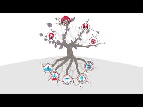
Our four strategic directions are a set of priorities that help to organize and plan the work of our seven-year plan.
Foundational principles
These five principles are the roots of Mission: Forward and provide the foundation for our actions and decisions; they are what allow us to flourish in the work we lead through our strategic directions. They guide our efforts and serve as a perpetual framework for our actions throughout our seven-year plan, and beyond.
Read the plan
Learn more about Mission: Forward, who we are, what we do and how we do it, as well as our aims for the future, through the links below:
Providence Research Strategic Plan
Providence Research uses research to improve the health and wellness of patients and communities. Providence Research combines teaching, knowledge creation and translation (sharing the knowledge we create) to prevent diseases and improve care.
In late 2020 and early 2021, we asked members of our communities to share their opinions with us. We used surveys, consultations, meetings, and discussions to gather their opinions. We looked at all the information they shared and found four common work themes (Reconciliation, Advocacy, Sustainability, and Ethics).
We then used these findings to create our strategic plan, Discovery Forward (2021-2026). This strategic plan will help us use research to achieve our shared vision. The plan outlines how we will solve important health challenges. We can do this by being agile and creative and acting quickly when we face a challenge.
This plan reflects our commitment to tackling local causes that will have a significant global impact. Solving problems in our community can have positive effects around the world.